Overview
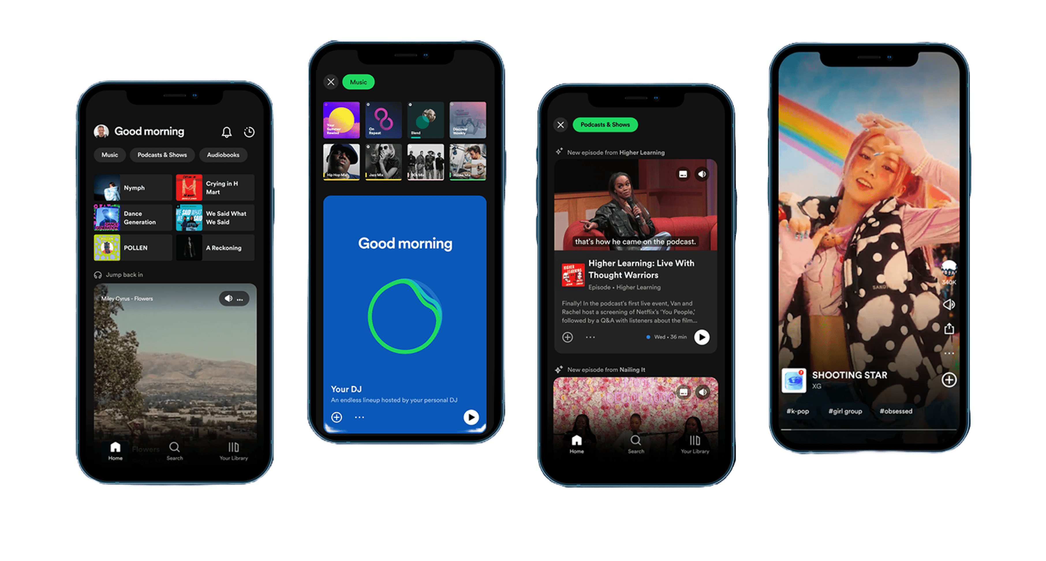
Spotify, founded in 2006 in Sweden, has grown into a global music streaming platform that has revolutionized the way we listen to and discover music. With millions of songs at your fingertips, it offers a diverse and immersive audio experience. Spotify is available across devices, making it accessible to people around the world.
In recognition of Spotify's widespread popularity among college students, this usability testing project aimed to unravel the nuances of user interactions, particularly focusing on those who are new to the platform. The decision to target this demographic stemmed from a desire to understand how novices navigate Spotify's features. The study's primary goal was to illuminate the intricacies of these features and pinpoint areas for potential refinement.
Key Insights
Participants were intentionally selected as individuals with limited Spotify usage or no prior experience with the platform.
Testing encompassed both mobile and desktop versions, focusing on tasks representative of the average Spotify user.
Mobile testing revealed challenges with locating and utilizing specific features like Blend and Jam, while desktop navigation proved relatively seamless.
Recommendations include the implementation of a guided tutorial for new users and the creation of an easily accessible help center.
Metrics
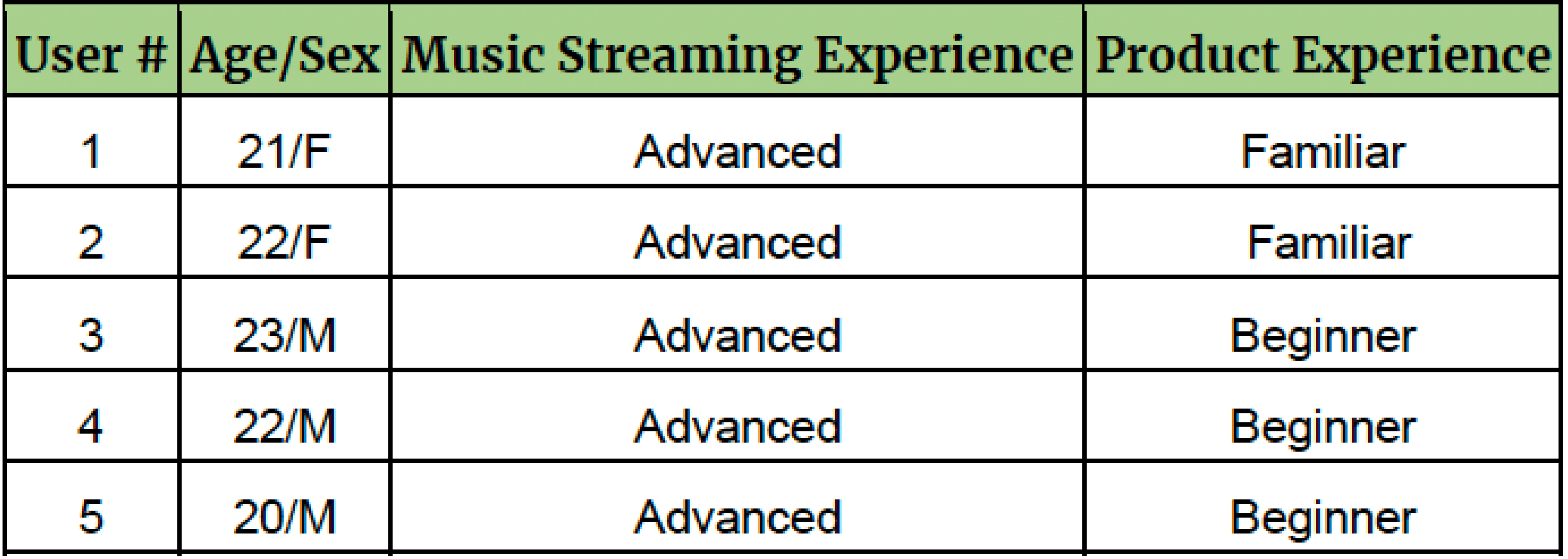
The pre-test questionnaire was designed to find users who had experience with other streaming services while having little to no experience with Spotify. We asked participants the following questions to yield the following responses.
Have you ever used Spotify before?
Used to have, then switched. (Familiar)
Less than 10 times (Somewhat Familiar)
Once or twice (Amateur)
Never used. (Beginner)
How often do you listen to music on a streaming platform?
Often (Advanced Experience)
Sometimes (Amateur Experience)
Not often (Beginner Experience)
Never (Brand New Experience)
Participants
Our team chose to recruit college students in the architecture building at Kennesaw State University. Since they were all digital natives, this made the testing process flow smoother as they knew how to operate smart devices and likely had experience with other music streaming services. We also made a strong effort to find those who had never used Spotify or had little experience with the app.
Tasks & Scenarios
Participants were tasked with completing 6 to 7 tasks on both mobile and desktop devices, each equipped with the Spotify application. A scenario was presented for both the mobile and desktop devices: “Imagine you are a college student who has recently installed Spotify on your phone for the first time. You are eager to explore the features exclusive to a premium subscription.”
Goals & Objectives
1. Observe and Analyze Interaction:
Examine how participants, unfamiliar with Spotify, initially interact with the platform.
2. Identify Interface Challenges:
Pinpoint challenges participants face in navigating Spotify's interface, focusing on both desktop and mobile versions.
3. Evaluate Cross-Device Consistency:
Assess the consistency and coherence of the user experience across diverse devices, including iPhones and MacBooks.
4. Document Issues for Recommendations:
Document and categorize issues encountered by participants, laying the groundwork for actionable recommendations.
5. Explore User Preferences:
Explore emerging user preferences, positive interactions, and features resonating well with participants during usability testing.
6. Address Transition Challenges:
Understand challenges faced by participants accustomed to other music streaming services, like Apple Music, identifying areas where Spotify can enhance the transition experience.
👋 You made it to the footer
Thanks for checking out my project! By the way, if you’d like to say hello or just talk about all
things design, feel free to
Or if you'd like to browse my other projects,
👋 Hey there
This project was completed for my Usability Testing class. The product I researched, Spotify, did not request this research and I am not affiliated with the company in any way. However, the users I talked to are real and these are insights that I would have applied to the product in reality. I’m proud of this work, but I just wanted to be upfront with that. Thanks for reading!

ORIGINAL LOCATION
RECOMMENDED LOCATION

RECOMMENDED LOCATION
ORIGINAL LOCATION
Please note that this project intentionally omits a formal conclusion. The focus remains on the presentation of findings, recommendations, and insights gained through the usability testing process. For further details or inquiries, feel free to contact me.
Note From Thanacha

RENAME BUTTON
NEW BUTTON
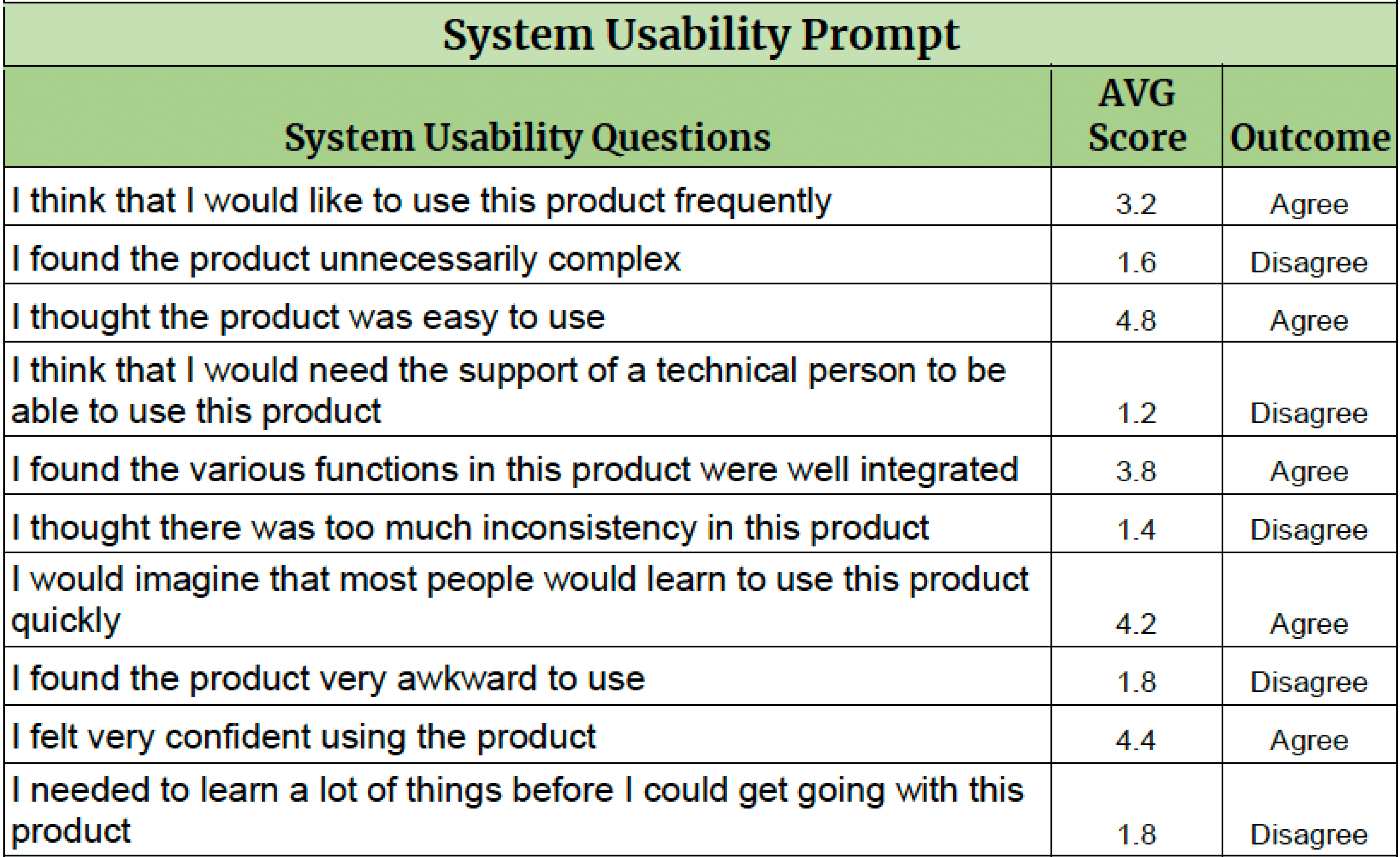
The S.U.S was comprised of questions on a Likert scale ranging from 1–5. The lower end of the scale indicated Strongly Disagree while the upper end indicated Strongly Agree. Calculations have been performed to yield the mean (average) response based on all 5 participants’ data.
Recommendation
These recommendations are based on our findings in the usability test. They are ranked in order of severity. 1 being major to 4 being minor.
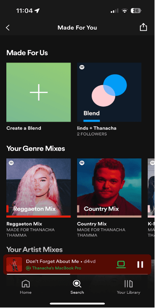
40% of the participants tested were not able to find the “Blend” feature.
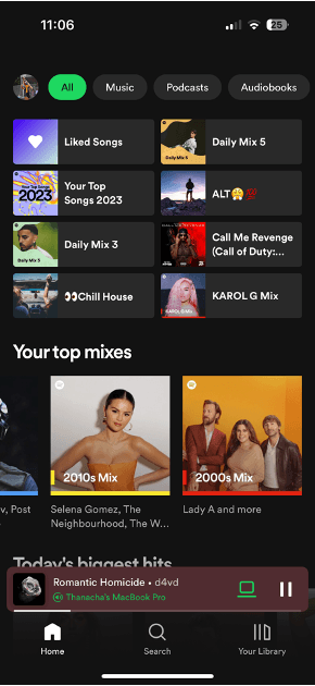
We recommend that the “Blend” feature get its own dedicated icon for users to click on. Throughout our testing, we noticed that users were looking for an icon to click on for this feature. As of right now, there is no “one-click” option for this feature. We find that to be detrimental to the usage of “Blend” because it is not obvious to a new user to use the search bar to locate it. A lot of Spotify’s features can be accessed in one or two clicks of an icon, so the lack of such confuses the user since they are used to looking for an icon.
The “Blend” feature is moderately inaccessible
40% of the participants tested were not able to find the “Jam” feature.
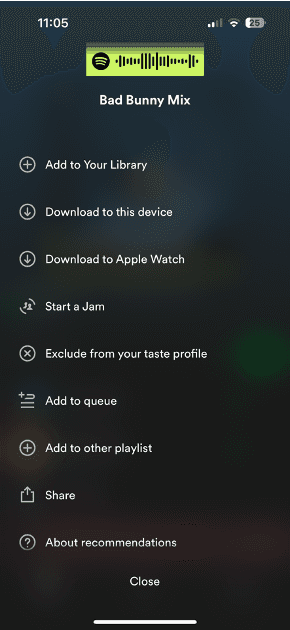
We recommend that the “Jam” feature get its own dedicated icon for users to click on. Throughout our testing, we noticed that users were looking for an icon to click on for the “Jam” feature. Because there is no dedicated icon, users had trouble finding the feature. We recommend that this feature get its own dedicated icon because it will make the feature more obvious to new users. And it will also make getting to the feature 2 steps faster rather than having to click on the “Speaker” icon, then “Jam”, then configure.
The “Jam” feature is moderately inaccessible
A help center for more complex actions would be helpful for new users as certain features are not as intuitive as others. We recommend that a help center be included for all users. Throughout our testing we found that users were fumbling around to figure out what to do which worked for most of the tasks as Spotify was designed with discovery of features in mind. However, for actions like finding settings, starting a jam, and creating a blend it took users far longer to find, and in some cases outright made the user give up because of the gap in design for discovery. With the inclusion of a help center, if users have any questions on how to access a feature, it can redirect them quickly and efficiently without making the user fumble around the app.
Inclusion of help center

Help
ORIGINAL INTERFACE
NEW INTERFACE
System Usability Scale (S.U.S)
Scenario 1: Mobile Tasks
Create a playlist. Name the playlist.
Write a short description.
Add 5 songs to the playlist.
Remove any 2 songs from the playlist.
Reposition/change the order of songs within the playlist.
Add a Spotify-made playlist to your library.
Hide 2 songs from the playlist.
Combine this playlist with the one you just created.
Add songs to queue.
Add 2 more songs to the queue.
Remove 2 songs from the queue.
Share playlist with yourself via text
Start a Blend
Start a Jam
Scenario 2: Desktop Tasks
Create a playlist. Name the playlist.
Write a short description.
Add 5 songs to the playlist.
Remove any 2 songs from the playlist.
Reposition/change the order of songs within the playlist.
Add a Spotify-made playlist to your library.
Hide 2 songs from the playlist.
Combine this playlist with the one you just created.
Add songs to queue.
Add 2 more songs to the queue.
Remove 2 songs from the queue.
Share playlist with yourself via text
Go to settings and edit playback.
Turn on crossfade.
Change playback presets.
Methodology
The goal was to get participants with little to no knowledge of how Spotify works. For this we went to the Architecture Building on the Marietta Campus and asked around offering $10 Starbucks gift cards for participation. After getting a confirmed five people to participate, we began testing.
Participant #1 took around 16 minutes, participant #2 took around 16 minutes, participant #3 took around 45 minutes, participant #4 took around 16 minutes, and participant #5 took around 18 minutes. The process was straightforward as we previously had worked up a script that followed different instructions for mobile and desktop. An iPhone and MacBook provided for use during the test. Participant #1 went through the process quickly, having issues with the blend feature. Participant #2 had little knowledge of Spotify prior to the session. When asked what made them act a certain way, their answer often was that they remembered some details to help them navigate around the interface. Regardless, they still found some issues with the Jam feature. Participant #3 struggled due to a lack of knowledge for Apple products, making this noticeably clear at times that the issue was not necessarily Spotify, but their lack of knowledge on how to work the iPhone or MacBook. Their issues with Spotify included finding both the Blend and the Jam Spotify Usability Test Report. Participant #4 uses their streaming services daily, so they were able to understand the basics and translate this to Spotify. Participant #5 was another Apple Music user and had issues with adding songs to the queue by accidentally sliding left on a song, but otherwise was able to complete the task.
Method 2: Think-Aloud Process
In the script we included a prompt asking the participants to “Think-Aloud” during their conduction of the test. This allowed us to gain variable data on what the participants were thinking about during their process, while also gaining insights on specific characteristics of Spotify that could have been missed when answering each of the questionnaires.
Method 1: Pre-Test Evaluation
The participants were asked a series of questions to see if they were qualified to take part in the study. This included questions on basic information, whether they had ever used Spotify, how often they listened to music on a streaming platform, and overall, how familiar they were with using music streaming services.
Method 3: Post-Test Evaluation
The post-test questionnaire consolidated our process of the study while also presenting post-test feedback on the Spotify Interface. This Questionnaire presented us with insights on how first-time users felt about the product, and if they would consider “making the switch”. Most of these questions were centered around how enjoyable, challenging, and the overall experience of Spotify as a streaming service.
Method 4: Post-Test Evaluation
The Systems Usability Scale is a standardized test focused on finding statistical data on Usability. This is a 10-item questionnaire in which participants are asked to examine the usability of a product using the scaled qualifiers from “Strongly Disagree” to “Strongly Agree”. This test allowed us to give a quantifiable score from 0-100 of how usable Spotify is as a first-time user.
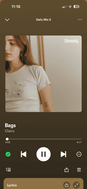
Users noted that the ability to combine playlists was enjoyable, however, we noticed this action is limited to only Spotify made playlists.
We recommend that all playlists, including user–made playlists, be made combinable and to change the icon name for the action. Throughout our testing, we noticed that during the task in which we asked users to combine a playlist with a Spotify made playlist, users tended to assume that all playlists were Spotify made. So, when they clicked on a user–made playlist and the prompt for combining the playlist did not appear, they seemed confused. We would then have to explain that only Spotify made playlists are able to be combined into a playlist the user made. This seems counterproductive to our team as the ability to combine playlists could be a staple feature if it were opened to all playlists rather than be limited to only Spotify made playlists. Also, since new users haven’t been on the application long enough for the algorithm to suggest playlists with music they like, it is not as attractive for them to pick it to combine it to their playlists.
Make all playlist combinable
Think-Aloud Protocol
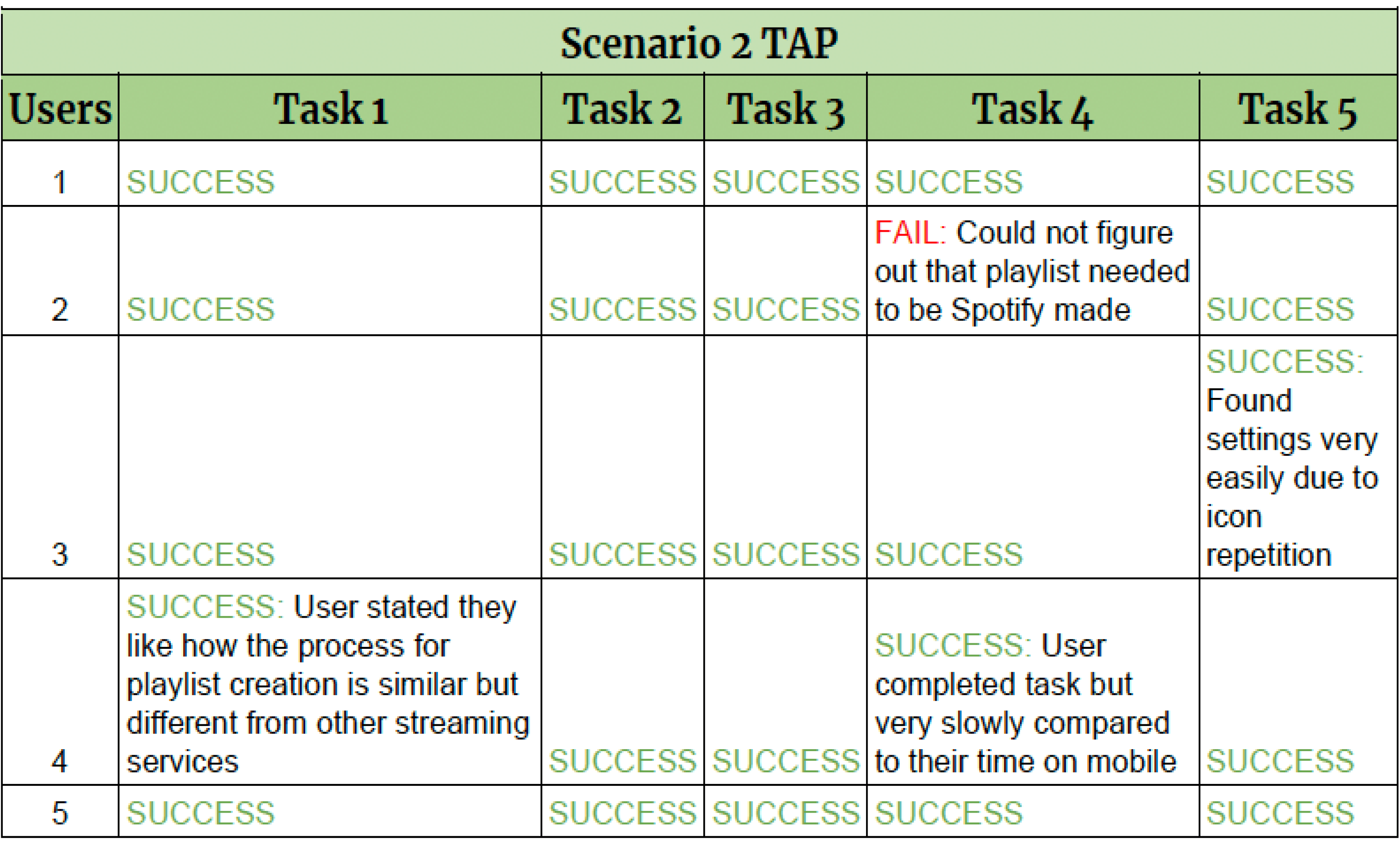
From this table, we see that on most tasks the participants were tested on passed with no issue. However, there was one participant who failed at combining Spotify made playlists to a playlist of their own. This shows that the desktop version of Spotify is much more usable for new users than on mobile device
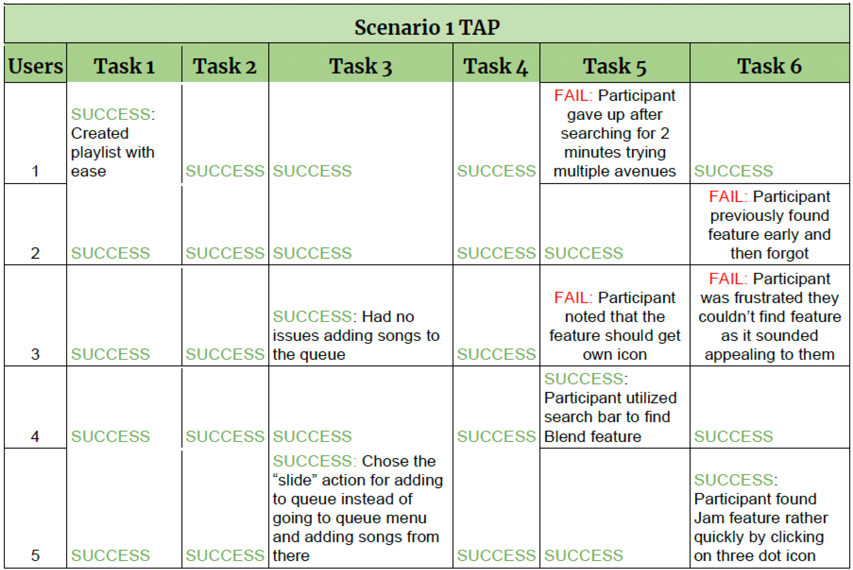
From this table, we see that on most tasks the participants were tested on passed with no issue. However, there were failures on accessing the Blend and Jam feature for many reasons.